


Problem
Significant Usability Challenges
Due to its deviation from industry standards, users struggle with the app's unconventionality, confusing navigation, misleading labels, undue exertion, and guesswork. Lack of intuitive design and significant learning curve leads to a potential loss of 77% of users on day three.
Goal
Redesign the Time Timer app to:
Improve usability
Reduce cognitive load
Create a more intuitive experience
Design for beauty and simplicity
Approach
Through a rigorous iterative design process, which included comprehensive user testing, prototyping, and multiple design cycles, I was able to deliver highly effective, user-centric solutions.
Conducted usability testing with real users to identify pain points
Created sketches, wireframes and interactive prototypes
Ran iterative testing cycles to refine navigation, labeling, and settings structure
Iterations focused on simplifying interactions and clarifying visual hierarchy
Research
Competitor Analysis &
Screen-by-Screen Task Analysis
Pain Point 1
After Setting a timer, users searched for a way to know that their timer was set and wasted time looking for a clue.
Pain Point 2
Users became frustrated and wasted a lot of time scrolling through the drawer and trying to figure out what all the options were.
Pain Point 3
Navigating between the plus icon, last, and timer is confusing due to multiple unclear menu and tab labels.
Performance Indicators
Decrease in user confusion during timer setup
Improved first-time task success rate
Reduction in time spent navigating to key features
Instant icon recognition and label comprehension
Solution
A redesigned Time Timer app with streamlined navigation, standard iconography, and clearly separated system vs. timer-level settings. Label copy was rewritten for clarity, and the interface was reorganized to support intuitive task flow.
Key Takeaways
Flow matters
Structuring the app around user goals reduced friction and made the experience more intuitive.
Clarity beats cleverness
Replacing unconventional icons and labels with standard, recognizable ones significantly improved usability.
Settings should feel obvious, not obscure
By clearly separating app-level and timer-level controls, the need for guesswork was eliminated.
Iteration is everything
User testing at each design phase was key to refining pain points and validating improvements.
Contribution
Collaborators
Edie Shieh
Managed the project timeline and provided valuable design reviews
User Participants
Thanks to Juniper, Puneet, and Sunday for user testing
Testing My Prototypes
Special thanks to Neha, Hilary, Justin, and Sidhant for their excellent and thorough feedback on the prototypes
My Contribution
Research
Initial design analysis, competitor research, UX product testing
Ideation
Information architecture, streamlined solutions from testing data analysis
Design
Second phase testing & analysis, flow chart, interface, sketches, Lo-fi & Hi-fi prototyping
Supplemental Images

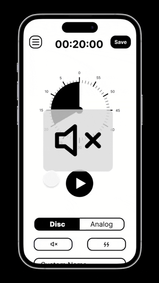
Many users reported challenges when trying to use the settings located in the “drawer”. The issue was that there were SO many options with no indication as to what the options were for.
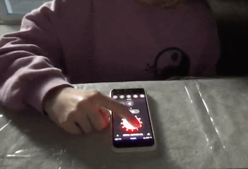
How it looked before.
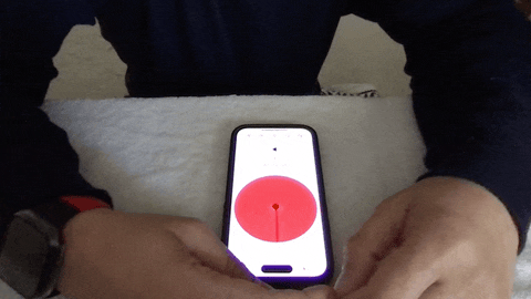
How it looked after.
Sketch
Improve our user’s experience potentially by as much as 30-50%


LO-Fi Prototype

Collect Data
Data Analysis

Adjust Flow Charts

Adjust Mid-Fi
Interactive Prototypes

Test,
test,
test.
Data,
data,
data.


UI Library


Next
Design System