

Enterprise
Design System
Created and implemented to fulfill the UX vision.
NAU Design System
NAU XD Vision Statement
To design intuitive user-centered software for the NAU community
intended to create inspired experience, opportunity and a sense of belonging.
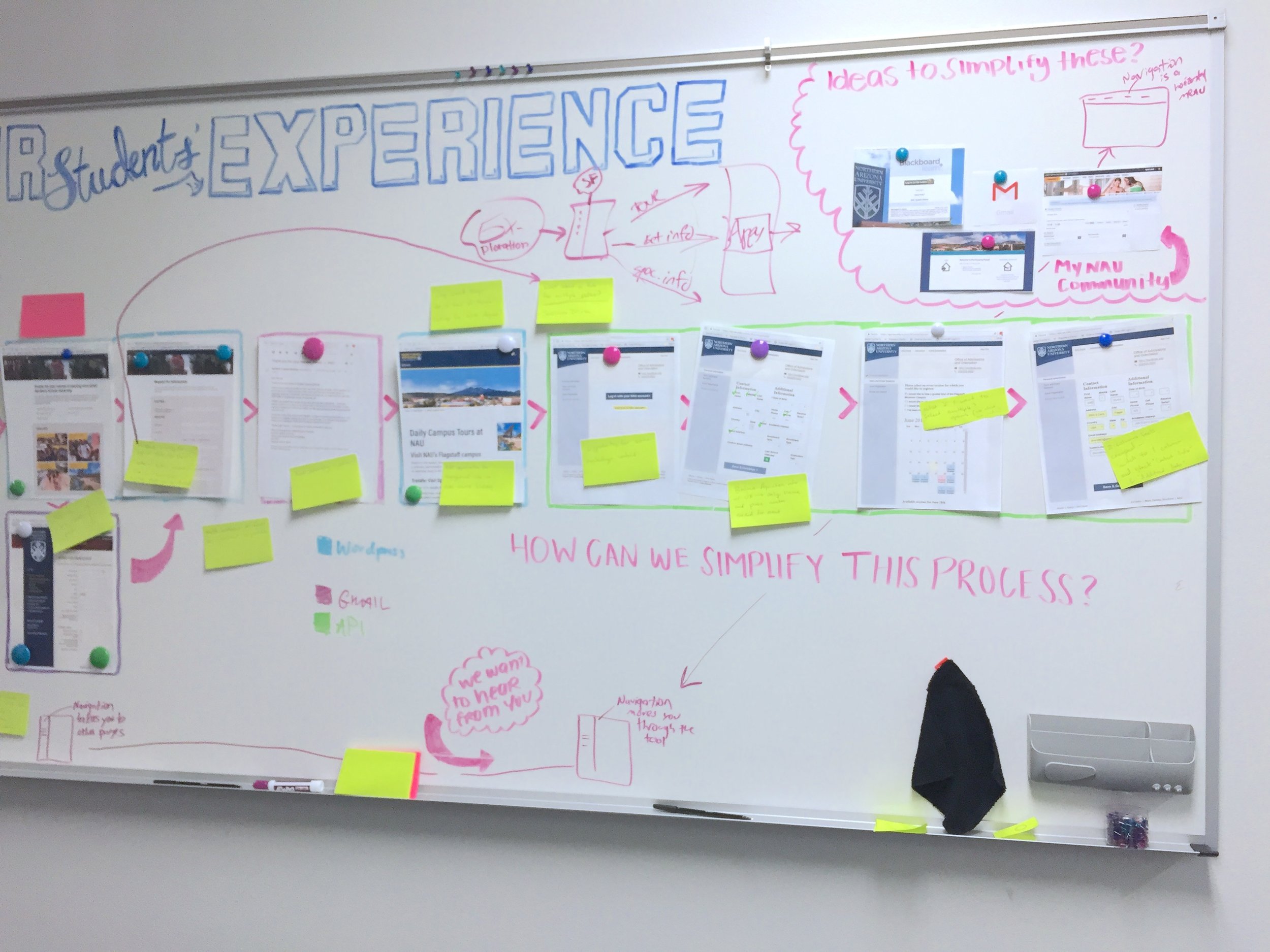
Problem
Before - Too Many Buttons
A major issue was the excessive amount of components and buttons. Without a UI library, our team was lost in a digital sea of chaos and inconsistency. This lack of a system forced designers and engineers to repeatedly reinvent solutions.
After


I implemented a UI library with streamlined components and buttons, turning them into a pre-built interface with standardized reusable elements.
Goal
Improve design workflow efficiency
Reduce design and development costs
Boost team productivity
Enhance focus on user experience
Approach
I led the creation of a scalable design system through deep research, component audits, and atomic design principles, aligning the system with Material Design standards. I designed and built a fully interactive component library in Sketch, integrated with ZeroHeight and Zeplin for seamless developer handoff, and supported implementation with over 400 hours of HTML/CSS. Through cross-functional workshops and presentations, I aligned design and engineering teams, ensuring clarity, consistency, and usability across the product.
Performance Indicators
34% increase of design consistency across the organization
50% improvement in design-to-development collaboration
3x faster design prototype creation
36% increase in UX-focused decision-making
Design and front-end costs were reduced by 40% due to decreased duplication and streamlined workflows
Productivity rose by 42% for designers and 30% for developers thanks to shared guidelines and fewer handoff revisions
A comprehensive UI library and design system were successfully created and implemented, resulting in a unified user experience. This solution established core principles and guidelines, delivered new UI components based on Material Design III, and provided detailed design specifications derived from product requirements.
Solution
Key Takeaways
Data Collection for Future Research.
By integrating user analytics and UX studies with the design system UI library, we can enable valuable future research.
Design systems scale impact beyond the design team.
Streamlining design workflows directly improved cross-functional collaboration, reducing time spent clarifying design specs or fixing inconsistencies.
Reusability drives efficiency and cost savings.
Standardized components minimized redundant work, leading to a 40% reduction in design and front-end development costs.
Better systems lead to better UX.
With foundational patterns in place, teams could shift focus from layout and styling to solving user problems—boosting UX attention by 36%.
Initial investment leads to long-term gains.
While the setup phase required coordination, the long-term benefits in speed, quality, and alignment made it a worthwhile strategic investment.
Contribution
Collaborators
Lyric Peate
Senior User Experience Designer
MS in Public Interest Technology
Brainstorming, Design System platform research and Purchase, financial scope, product horizontal scanning, collaborated together on cross department presentations, collaborated on the wireframe and high fidelity mockup design.
Code: 400 hours of code HTML/CSS
Jason Robinson
Team Lead
My Contribution
Management
Led all design timelines and product maps, led Eng workshops, defined product scope with UX Team Lead.
Research
Deep research into Design Systems. Current component audit, defined color palettes Hex Codes, atomic design, initialized core-concept analyzation system with code, designed all components based on Material Design, built library in Sketch, naming system, UX team and Eng keynote presentations.
Ideation
Information architecture, streamlined solutions from testing data analysis
Design
Component design, content iteration, high fidelity mockup design, interactive library in Sketch, system Zero Height, Zeplin Code, Google Material Design.
Code
400 hours of code HTML/CSS
Supplemental Images
Keynote Presentation
Gave keynote presentations to developers and engineers, facilitated user advocacy, cross-departmental collaboration, and the gathering of feedback and new perspectives.


SET Presentation Outline:
Introduction framework of talk (or put on footer of slides) M
What if you could…big picture vision M
What is a design system? (briefly) M
Challenges/Solutions L
Student experience -> cohesion/consistency
Wasting time -> Invents a wheel once, then reuses it
Unclear responsibilities - > Clarifies roles
Disorganized design artifacts -> Provides framework for versions
Free-for-all -> Resource that survives turnover and makes on-boarding quicker
Demo design -> Design something from scratch vs. speed of DS M/L both sharing screen with M narrating
User Interface Library
Before & Afters
Before

Below are 3 before and after cases that demonstrate the improvement of introducing the UI Library, increasing productivity and consistency by 3x.
After

The “Class Roster” was my first web application designed using the new UI Library The process was fast, enjoyable, and straightforward!
Before
The “Dining App” was designed for mobile browsers but without a mobile app, students often accessed it via desktop and this is how it appeared.

After
Using our new UI Library I created this in the blink of an eye, a desktop site that was useful and beautiful to use.

Before
The “Class Funding Request” was one of many many web tools that I was tasked with simplifying a complex issue. The UI Library made the process focused and quick.

After
The new UI Library allowed me to live quickly and easily by my values, creating products that are beautiful, intuitive and effective.

Inside the Design System


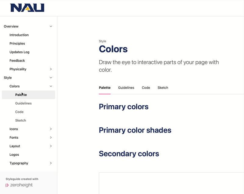
The Primary and Secondary colors are stored in the Material Design Sketch Plugin, making instant iterations instant and seamless, building on Material Design insights.
Final Product
The final product is a combination of all components, with their descriptive code, linked directly to the Sketch Library where they can be created and altered.
Next
NAUgo